The job search: Many people struggle to find a career path and the experience can be overwhelming.
CareerBridge: Narrowing the complex process into 4 areas of focus, CareerBridge works with employers to provide job applicants with knowledge of what skills they really need to learn to raise their qualification level. Job applicants target their job, build a resume for that job, earn skill credits to enhance their resume to raise their qualification levels, and apply to their target job with the resume they have built.
Research and ideation:
Personas were created from the data collected by interviewing potential job seekers who have struggled at some point in their life. This offers insights on people with different struggles and goals in their job searching.
Click on the buttons to view interviews and user journey maps.
User journeys were created to help think through how users would interact with CareerBridge.
A competitive audit was conducted to gather insights on what is already being done in the job search and career building space. Some opportunities were noted to improve a job seeker’s experience:
● Explore more effective ways to network and communicate.
● Explore ways to build resumes that specifically target job postings.
● Explore specific ways to connect job requirements with learning material.
● Explore ways to guide users through the user flows in a concise manner.
● Explore ways to make lots of information digestible.
Crazy 8!
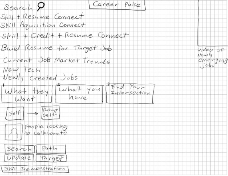
I started making quick sketches with the Crazy 8 method to generate ideas. I had the idea of simplifying the complex job search process into areas of focus. I was thinking about job searching, building a resume, learning skills, and targeting a job with the resume you build before applying. I wanted there to be a concrete level of focus on a path from beginning to end while also helping people become more qualified.
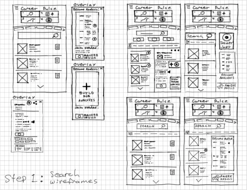
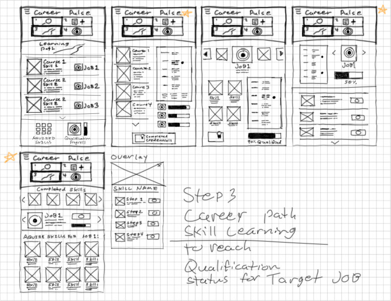
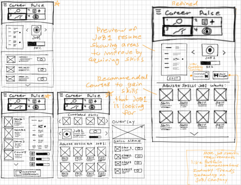
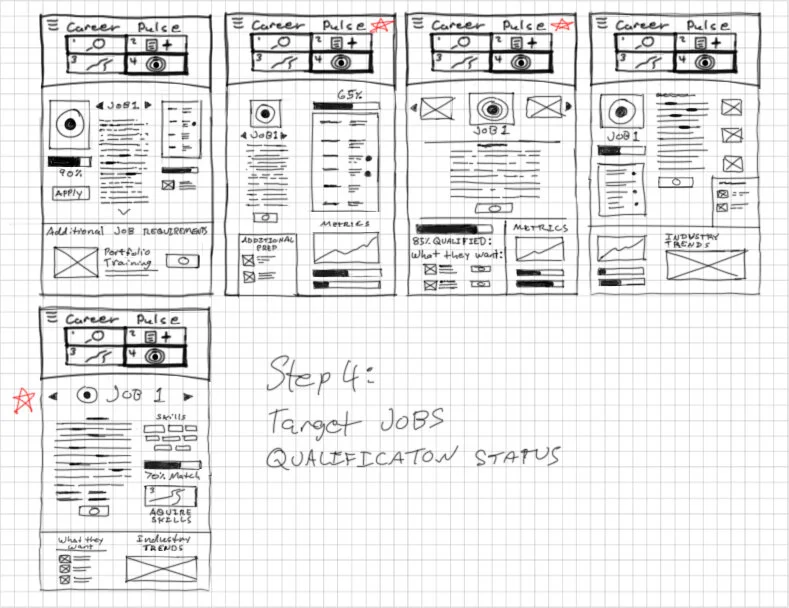
Paper Wireframes
Since I like to draw in Photoshop using a Wacom tablet, I created hand drawn wireframe sketches in this way. This is where some of my concepts of this project really started to come to life which helped a lot going forward. Since there are a lot of job and career building websites that are successful, it took a lot of thought and conceptualizing to think about how I could offer something that can help in a way where they are not helping.
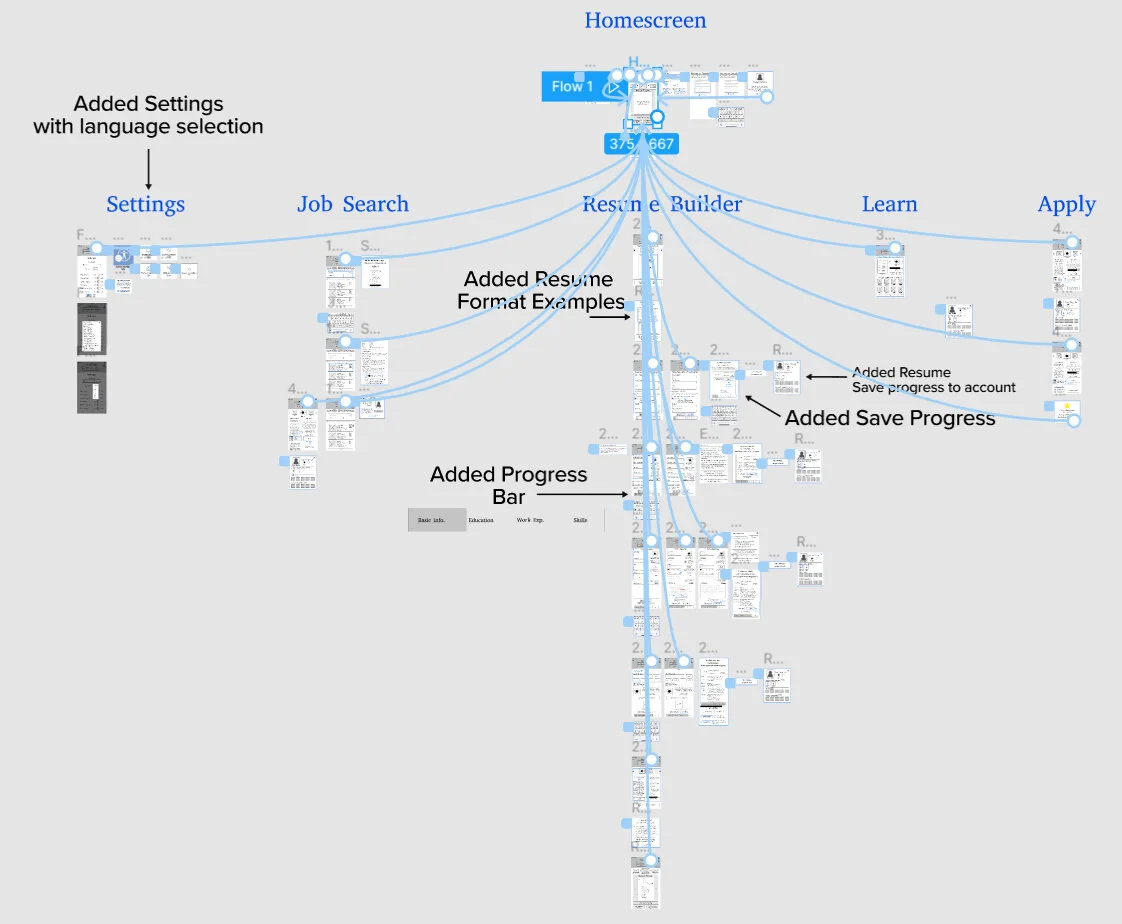
Sitemap
Digital Wireframes
Here are the digital wireframes for the homepage and the screens dedicated to the 4 areas of focus.
Low-Fidelity Prototype
I created a low-fidelity prototype from the wireframes, to create screens to guide users through the job search, building a resume, seeing what skills they can learn to raise their qualification level, and applying to their target job with the resume they built. I then conducted a usability study and got valuable insights from organizing feedback with an affinity diagram. This helped my design decisions going forward.
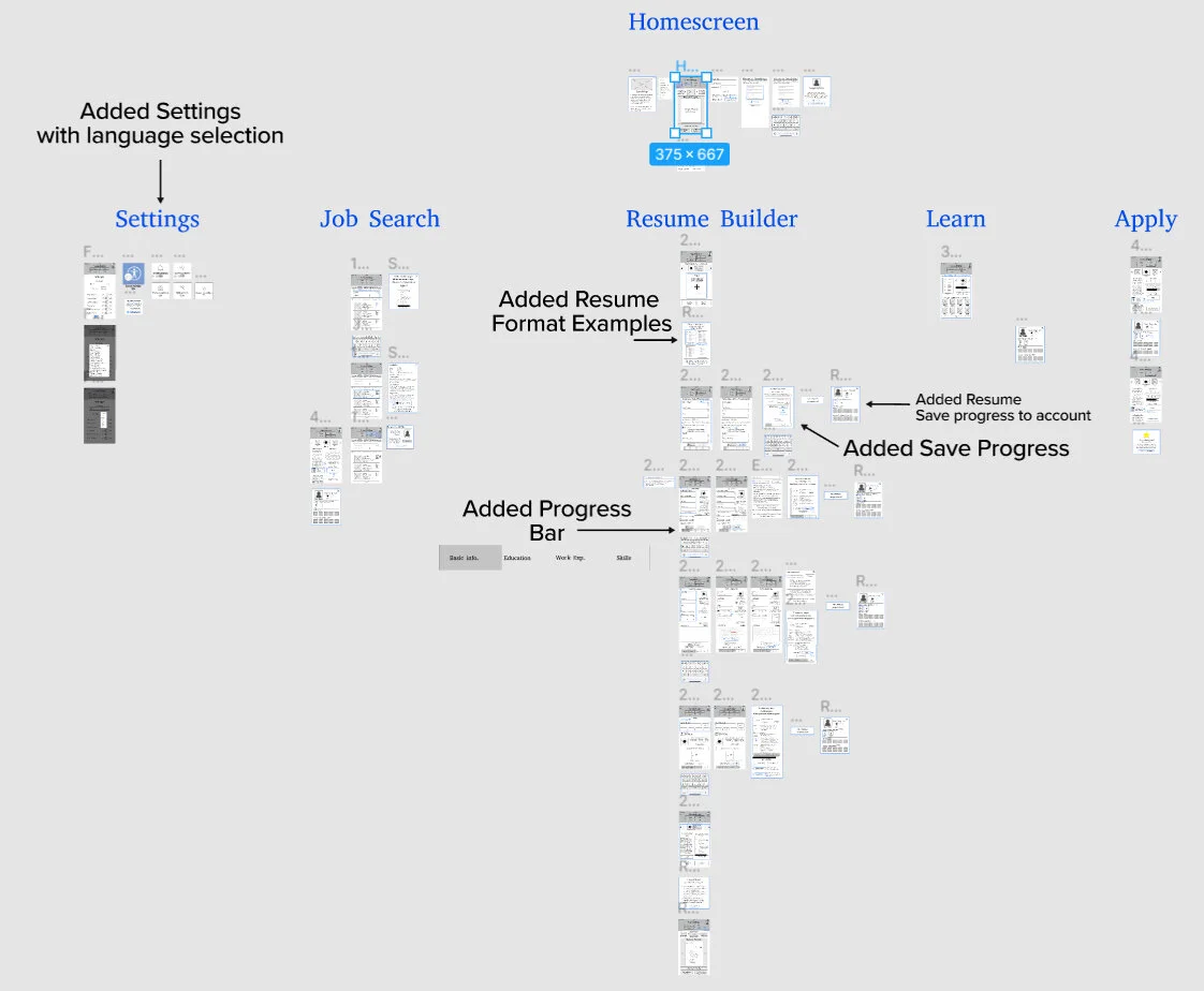
I marked the changes I made based on the insights I gathered from the usability study.
A closer look at the changes I made:
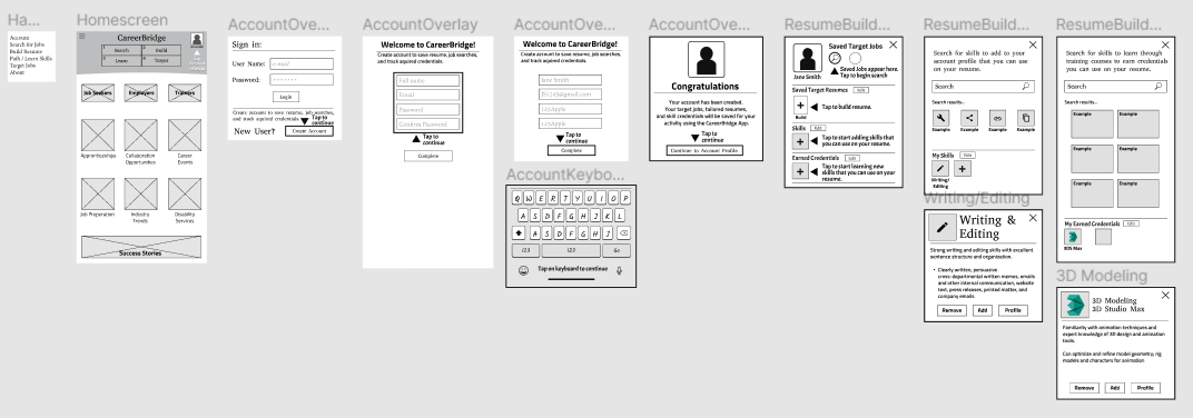
I created an overlay for the account so users can see where their target jobs, resumes, skills, and earned credentials will save.
This overlay to show the user template options is a way to show them they do not have to stick to one kind of template depending on the information they are using and the job they are applying to.
This is a continuation of the account overlay where the resume is guided to select the resume they have built to apply to their target job.
Language, font size, speech recognition, and screen reader were accessibility features I was thinking about, and the ability to turn the highlighted guides on or off.
Progress bar that was added to tell the user how far they have come in their resume building journey.
Here is a closer look at the resume builder. In this example, it guides the user to fix a typo before adding the information to the resume. I was experimenting with elements that could be useful such as: a preview of how the target job requires 3 years experience, a button to add credentials you have earned through training, a button for workshop options to earn credit for your resume, and a resume preview.
Mockups
I started created vector illustrations and a sticker sheet to start bringing the low-fidelity wireframes to life.
I created an about overlay that can be accessed from the hamburger menu, and I also started creating vector images of jobs that show up in the job search screens.
High-Fidelity Prototype for Mobile App
With some colors and illustrations established, I conducted another usability study for the high-fidelity prototype.
I identified some additional changes to make from the prioritized insights gathered from the usability study results.
Adaptive Web Design
The next step in designing CareerBridge has been to create the adaptive web version that can fit the screen sizes of the devices the intended users are most likely to use.
CareerBridge Use Case
Thinking about the use case for the app version and the web version helped with making design changes to fit the web experience that is different from using the app.
The app version of Careerbridge simplifies the job search, resume builder, learn skills, and apply to job into concise, core areas of focus.
The website version has the same content but it is unpacked a bit so that it is not as condensed to fit on a small screen.
This version also has an advantage when it comes to typing. Many users will not use voice command on the app and feel it is easier to type with a keyboard so many people would prefer entering information using a computer.
How Might We? and Crazy 8
Some thought exercises were done to think about how I will move forward with the adaptive web designs. How might we helped me think about how to solve user pain points with different perspectives. The crazy 8 exercise was done to sketch more ideas for how CareerBridge would work as an adaptive web site.
I created wireframes to fit the screens of mobile phones, tablets, and desktop screens. My focus going forward was on mobile phones and desktop screens because potential users are more likely to use the CareerBridge website on their phones, or desktop computers at home or at the library.
Low-Fidelity Wireframes of Adaptive Website
Wireframes of the account creating user flow from the homescreen.
Mobile phone
Tablet
Desktop
Low-Fidelity Prototype
A usability study was planned to test the changes made to the user flow of the desktop web version.
Since the screen size is larger, I decided not to embed the prototype on this page but rather create a button that takes you to the Figma link if you are interested in trying the low-fidelity prototype.
The user flow has changed from the app version where the user is prompted to create an account after they found a job they would like to save.
After the account has been created and the target job has been saved, the user is then guided to start building a resume to target the job. The target job is displayed beside the area where they begin their resume building journey.
Mockups
More vector illustrations were created to put on the new layout of the homescreen for the desktop version. I tried to think about valuable resources for job seekers such as apprenticeships, collaboration opportunities, career events, job preparation, industry trends, and disability services. The background, buildings, and buttons were changed to have less height and more width so they would not dominate the entire screen on the desktop experience.
High-Fidelity Prototype of Adaptive Website for Desktop
Since the screen size is larger, I decided not to embed the prototype on this page but rather create a button that takes you to the Figma link if you are interested in trying the High-fidelity prototype.
Usability Study and Affinity Diagram
A usability study was conducted to test the high-fidelity version of the adaptive website for desktop. Based on the prioritized insights I gathered from the affinity diagram, I changed the location of some highlighted guide text to make it more clear where to click to select your resume to apply to your target job.
Case Study
I put together a case study in PDF format to give a summarized overview of the entire project from beginning to end. Click on the button to take a look at a nice summarized version of all of the steps taken in designing CareerBridge.
Challenges:
There job search, resume building, and e-learning websites that exist today are successful in their own ways and have changed the way people search for jobs. However, with that said, there are still many people who struggle and become lost. It took time to think deeply about how to simplify a complex process and offer a targeted approach with valuable insights. Iterations on the designs were necessary to further paint a picture of how this project could work. It took a lot of adjustment to the graphics and font size to adjust from a mobile phone format to a larger desktop format. From the small screen I was in the mindset of making things large and easy to see, but it had to be adjusted for the desktop version so that one graphic did not take up the entire screen.
What I learned:
Each step of the design process helped make a difficult concept seem more possible. It gave me insight on the hard work that other job search sites put into what they have now. It has also shown me how much content you can present to a user. Even with a lot of opportunities to make better features than what already exists, there has to be a way to maintain a simplicity that does not overwhelm users in what is already an overwhelming and stressful experience for many.


